Indicator Applet & libnotify support for Thunderbird
This looks great!I’ve never really got on with Gnome‘s Evolution (the default mail client in Ubuntu) and so always install Thunderbird, Lightning and other great extensions for the Mozilla family of products on my Ubuntu desktops and laptops. Since the new notification tool (9.04?) and then the Indicator Applet (9.10) were introduced however, Thunderbird hasn’t been able to avail itself of these useful tools. Until now.
Ruben Verweij has created a small Thunderbird extension that seems to fix this limitation. Simply follow the very clear and easy instructions on his blog post to create the .xpi package and then install it in the usual manner. I had to install the Ubuntu package libnotify-bin to get the notifications working but that was easy: sudo apt-get install libnotify-bin.
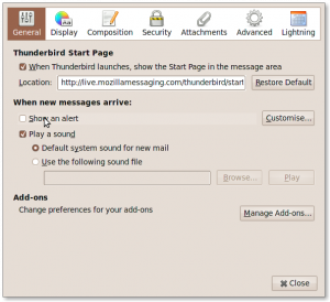
You can then turn off Thunderbird’s internal notification tool as shown here. This stops the old-fashioned opaque pop ups that usually appear in the bottom right of the screen.
As Ruben is clear to point out this is still experimental so all the usual rules apply and YMMV.
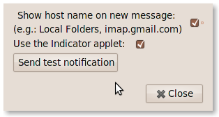
It has worked for me so far and was easy to install and set-up. In fact, I only just noticed, whilst I was writing this, that there is a “preferences” dialogue for the extension. Short and sweet:Thanks Ruben, this is a great addition.
Thunderbird 3 on a netbook?
I’ve been discussing the layout of the forthcoming TB3 release on their mailing list recently.
Since I installed it on my new Asus 1008HA on top of the Ubuntu Karmic Alpha build I’m having a bit of an issue with the [relatively] huge size of the header panel for messages. According to a quick measurement in the Gimp, the header is using 137px of vertical space. Netbooks typically have a 1024x600px resolution, some are even smaller. 137px represents almost 23% of the available vertical space.
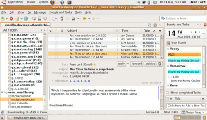
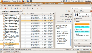
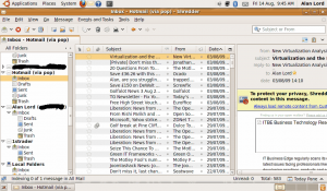
Here’s a screenshot showing the typical layout I prefer clearly showing the space required by the header. Note that I also have the Calendar plugin Lightning installed too.
There used to be a “compact header” layout that took up much less space but allowed you to see more of the information if needed. But for reasons I do not understand that has been dropped from the current builds which seems a bit of a shame to me. The size of the header is making TB3 quite difficult to use on the increasingly popular and common ultra-portable devices. I am assuming this will be same if you are using another operating system too.
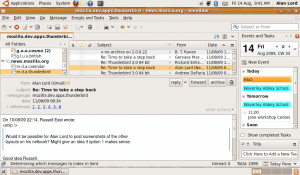
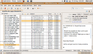
It was suggested that I try one of the other “views” or layouts that you can choose in TB and provide some screenshots too. Here you go then:
As you can see, the header impacts the available message body considerably in all layouts. One thing I realised though is these screenshots show a plain text email from a newsgroup reader. How about another common type of email then? HTML…
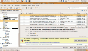
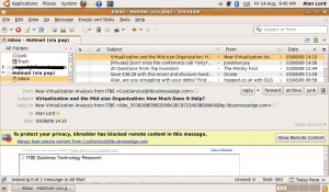
I find these images even more telling. Note how there is virtually no working space in the Classic View to determine if the mail is one you want to allow images to be loaded. I don’t think the Vertical view works at all and even the Wide View which is probably the most usable of the three seems to just draw your attention to the header and not to the message itself.
I also notice that there is a rather silly bit of wastage to do with the Calendar and Tasks buttons (underneath the search box). Why can’t they appear alongside the rest of the main toolbar? If you have multiple tabs accessible then I can see why we need the row to hold the tabs, But when there isn’t a tab open, is it really necessary? Whatever the case, I see no reason why the Lightning buttons need to have their own toolbar. That’s just waste and unintuitive. I’d expect those buttons to be with the others, not out on their own like that.
I will post a link to this blog page on the mozilla.dev.apps.thunderbird mailing list for all to see and hopefully comment.
Don’t get me wrong though. I really like Thunderbird. I have a strong preference to it over Evolution. Whenever I have tried Evolution I’ve found it difficult to use (in the sense it isn’t obvious), and it failed to work with our CalDAV calendars which was a known and long standing bug (I am not sure if this is still the case). It also didn’t feel as stable as TB, and considering I regularly use Alphas or nightly builds of Thunderbird and Lightning that is saying something. There is also a bug that has been open since 2004 with the title “Evolution is unusable in 800×600 or 1024×768”. It has seemingly received little attention since it was reported 5 years ago.
A recent post to the bug above pointed me to a blog post by Srini Ragavan discussing a new development going on for Evolution specifically to create a UI that is better suited to small resolution displays called Anjal.
Anjal looks to be a very interesting development and one I will be following closely. If Evolution gets to be as easy to use and as polished as I feel about Thunderbird, then I might well end up giving it a try again.
