Ubuntu Rebranding
We have known for quite a while that aubergine was likely to be the new brown and this week the new look for Ubuntu has been shown for the first time. Here is the new logo, complete with the white on orange circle of friends image.

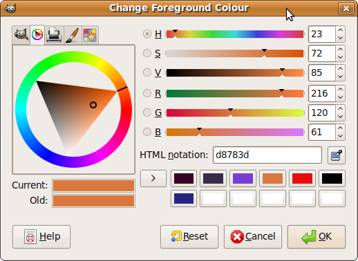
So what colour is that exactly? I copied the logo into the Gimp and used the eye dropper tool to pick out the orange from the circle of friends. The top set of three sliders show the hue as a location round the colour wheel in degrees, saturation and value are basically the amount of white and black added to it. So this orange lives at 23 degrees.

Now lets take a look at the aubergine that makes an appearance as a solid colour on the startup screen.

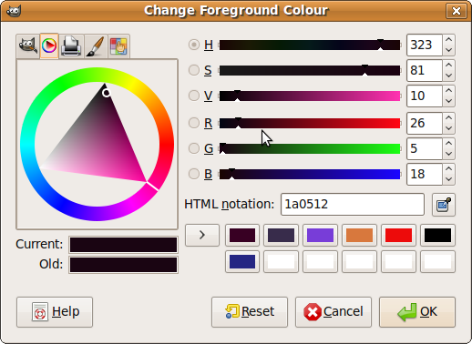
Using the same trick in the Gimp we can see that the aubergine is a dark shade of the hue at 323 degrees, exactly 60 degrees apart from the orange. Relationships between colours on the wheel tell you whether colours will go together or clash. I have to admit to not actually understanding this aesthetically, but I like the numbers behind it all. I expect 60 degrees mean they go together jolly well.

So what does this branding mean for us? Well it is aiming to provide a more professional and enterprise feel to Ubuntu, which is exactly what we want. It also means we have rather a lot of printed leaflets with an Ubuntu solution provider logo that is going out of fashion soon, we will have to get them out in front of customers as soon as possible!
Tags: Ubuntu


[…] Link: Alan Bell: Ubuntu Rebranding […]
DUDE! That looks BADASS!
Hi, try Agave, that program does that exactly:-)
Regards
[…] Ubuntu Rebranding […]